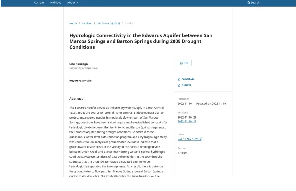
The default theme that ships with OJS 3.0+ and OMP 1.2+ is designed to work great for a broad range of users. It employs a simple, straightforward design style that’s easy to tailor to fit your needs and ensures your content is easy-to-access no matter what.

This OJS site demonstrates the Default theme.
The default typography uses fonts from Google’s Noto family, specially-designed to improve visual harmony across as many languages as possible. A wide variety of character sets are available from Google’s web font repository.
The Default Theme has deliberately chosen a simple, no-fuss layout with a neutral color palette. This makes it easier for your brand to stand out with just a few simple changes to the color and typography in use.
As of OJS/OMP/OPS 3.3, the Default Theme has been externally audited for accessibility and adheres to best practices like colour contrast, keyboard navigation, and form/link focus. PKP Accessibility Statement contains further details. Note that changes made to the theme may impact accessibility.
The simple structure of the Default Theme makes it easier to extend with Child Themes. A large set of LESS variables can be adjusted to override font sizes, colors, borders, responsive breakpoints and more.

Leave a Reply